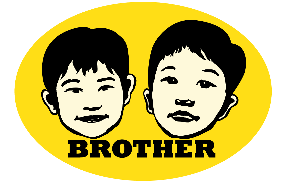

Yeah! they are my boys. Both my boys recognized themselves after I applied the sticker on their door. It is hilarious to watch while they were looking at their own face on their door for the first time. My younger son told me that it is the brothers’ room, it’s Chase’s and Ryan’s bedroom. “That’s right, it’s brothers’ room.” I said and smiled.
I got this idea from class for using image trace by Illustrator. After I came back home, I tried to find some pictures for doing the image trace. “Why not my boys’ face?” I asked myself. So I started digging in those picture of their lovely faces. I found the light could be the issue to do this kind of effect, I applied all pictures with posterize in Photoshop and adjusted to level 2, in order to see the pictures in black and white enough for me to see the figures. Finally, I got some pictures that I could use for the next step. Then I went to Illustrator to do image trace, the result isn’t good enough to do the cut out, so I improved some area until I felt they were good enough to do the cut out.
Originally, I made this for my two boys, the result came out pretty good, this design looks just like a logo for a company.
Font set of lower case letter, numbers and symbols.
Another fonts set was lower case letter, numbers and symbols. Although it maybe difficult to define the location and size in lower case letter, the glyphs are still able to adjust to a consistent body size in Font Creator program .
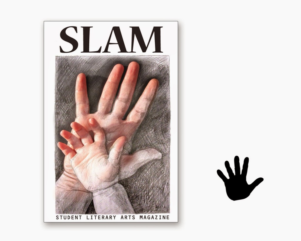
Cover artwork for SLAM.
Here are my two Student Literary Arts Magazine cover artworks and one color Folios. I picked two artworks that I created in Art101 and Art 201 classes. Then I used the skills that I learned in Photography, Photoshop and llustrator classes to put the artworks together. I am pretty happy about what I have made so far, it is a blessing to have my own creation on the book cover.
Creating an Interactive Infographic PDF
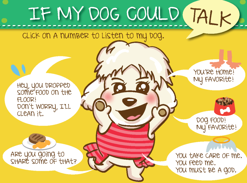
It is an Interactive Infographic PDF I created with Illustrator and Indesign. I was drawing one of my favorite dogs.I looked at her and thought about what was her feeling.
During dinner time, my dog, NiuNiu, came to sniff around my feet and scratch on my leg, then I figured out this assignment idea. So I went to my laptop to start drawing her fat body and her puppy dog eyes. The layout graphic basically created in Illustrator then save as web to PNG file and place into Indesign to finish interactive part. The button was functioned by Indesign . The goal is make it like an interactive interface, in fact, it made up of six pages, when people click the button, it goes to different pages.
I like to do this kind of interactive assignments because Indesign make it’s process so easy to do.
Designs for a playing card game
I started thinking about what we had learned lately in the class. The point is, what kind of theme I can put on this playing card design. I settled my mind on the wall or something like fence, bushes… etc. For hours, I google the web, and one of the image called Geometry Shape Bushes caught my eyes.
There are four cards design to make a game: Wall, Reinforcement, Damage Section and the Card Back design. So in my mind, there is an easy direction to follow with, garden scissor as the damage, and fertilizer as a reinforcement.
I started with a bush image I found on the web, and I stamped those leaves to fill up a rectangle shape bush. I created a simple shadow under the bush to make it more stereoscopic. And I finished the four designs in sequence by then. The most interesting part is making the card back design, I recall the thematic text assignment I did before. Instead of the fur brush I used the bush brush to create the design.
Overall, I like my game card design, I hope it will turn out well after printing.


